The frustration that started it
"What streaming service has this movie?" is a question I'd googled dozens of times. The answer always involved three tabs, a scroll through an outdated availability page, and eventually giving up. The data exists. It just isn't well-surfaced.
I built TVLens at AppyHigh to put the answer in one search box.
What it is
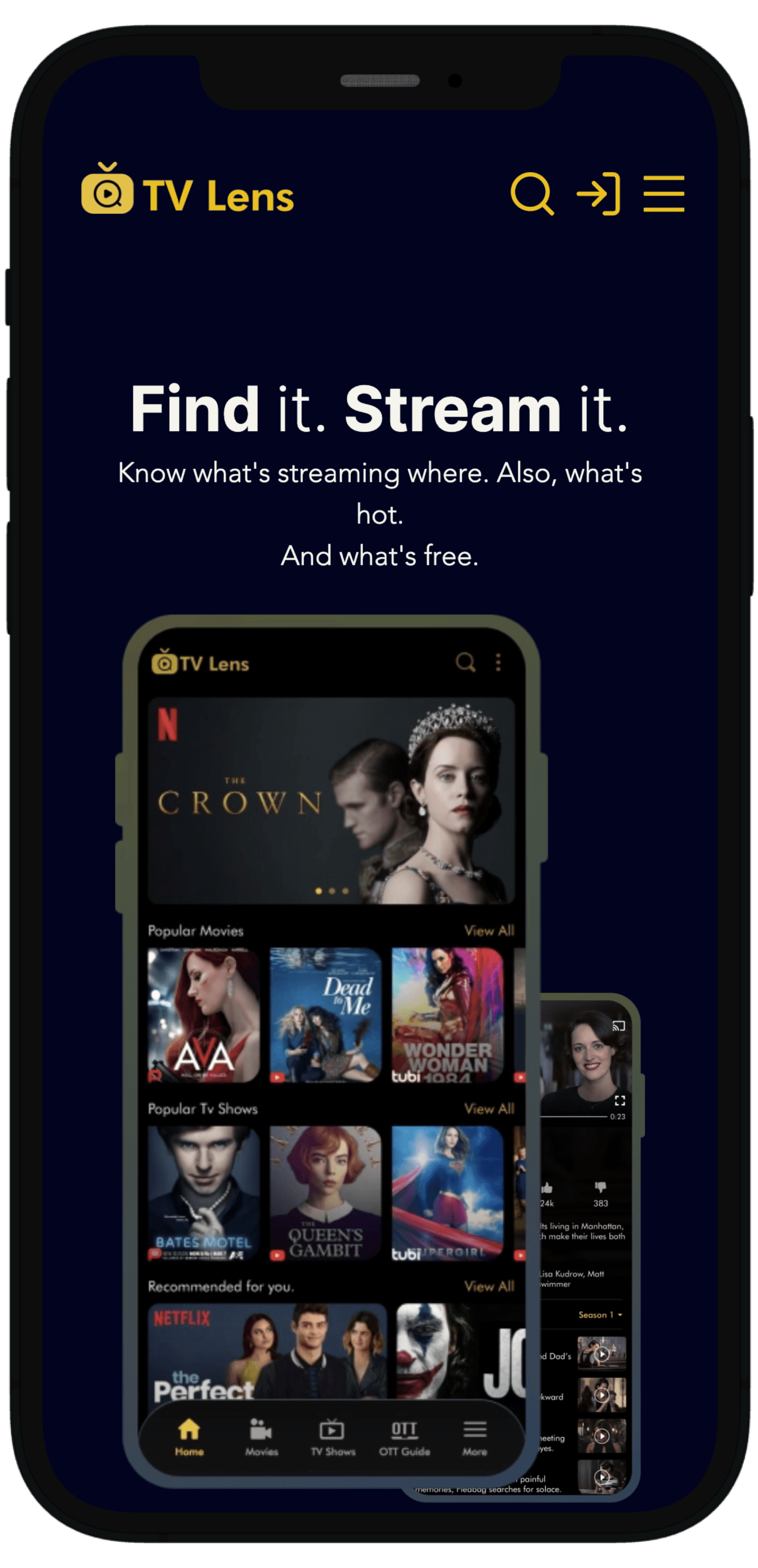
Type anything — a movie, a show, an actor — and get both what it is and where you can watch it, scoped to your country. Trailers, ratings, and a watchlist that syncs.
Design decisions
Search first, not menus
Most aggregators lead with a category grid of genres and "trending". TVLens leads with the search box. Categories are there, but under the fold — because the job when you open this app is usually "I know what I want, just tell me where."
Make it feel instant
Add to a watchlist and it renders immediately, syncs in the background. Move between a show and a season and it's pre-warmed on hover. No spinners unless you're actually searching.
Architecture
A light Next.js frontend sat in front of a BFF-style API that composed metadata and streaming-availability sources into a single response shape. React Query handled cache and revalidation. Framer Motion handled transitions — the trick was making them feel like information architecture rather than decoration, so a detail page zooms in from its card instead of navigating away.
The lesson
Search is a superpower when the domain has natural "I know what I want" intent. I didn't need to teach users about genres or moods. I just needed to get out of the way.